library(sf)
library(dplyr)
library(ggplot2)
library(countrycode)
library(rnaturalearth)
library(ggspatial)In this post, I create a basic world map – specifically, a Choropleth map. That means we colour the countries by a specific variable.
Preparation
First, I load all necessary libraries.
Then, I declare some countries. I standardize their names with the package countrycode, so that we get these countries’ ISO3-codes.
my_countries <- c("Afghanistan",
                  "Federal Republic of Germany",
                  "USA")

my_countries_clean <- countrycode(my_countries,
                                  origin = "country.name",
                                  destination = "iso3c")
I then load the data for the map. It’s saved in a format called sf, which stands for spatial feature. We can treat it just like any other data frame, but each row has a column called “geometry”, from which the coordinates of the row can be plotted – in this case, a country’s outline.
Then, we create a new variable: we check for each observation if it’s part of our my_countries_clean vector.
world <- ne_countries(returnclass = "sf") |> # load world
  # check for each country: is it in my_countries_clean?
  mutate(is_my_country = iso_a3 %in% my_countries_clean)
Tip
If we start off from a data frame instead of a vector, we would merge the two data frames. Then, we don’t just end up with a Boolean variable, but with all of the variables of the joint data frame.
Plotting
Now, we’re ready to plot our map!
Basic map
We can simply do this with ggplot, with the function geom_sf. It takes normal aesthetics, so we can just hand it our variable of interest – is_my_country. Since this is a map, it makes the most sense to just fill the polygons according to this variable, so we use the fill aesthetic.
ggplot() +
  # plot an sf object
  geom_sf(data = world,
          # fill it according to my variable
          aes(fill = is_my_country))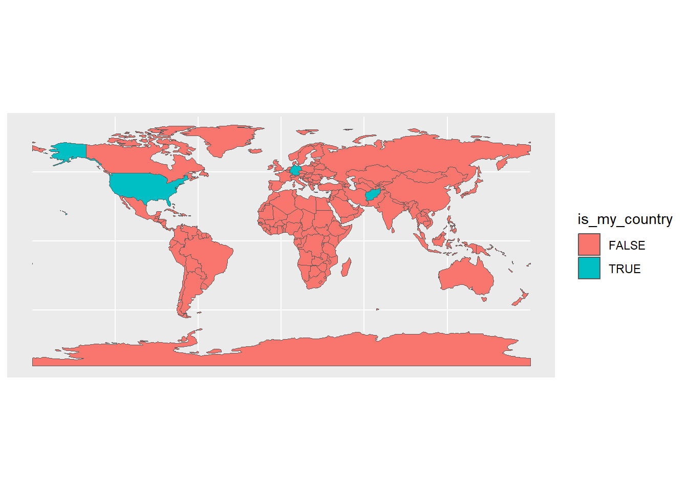
Intermediate map
We now decrease some of the clutter. We get rid of the legend since it’s just a Boolean – we can indicate this in our title/caption. We also choose different colours, and get rid of the gridlines.
ggplot() +
  # plot an sf object
  geom_sf(data = world,
          # fill it according to my variable
          aes(fill = is_my_country),
         # don't show the legend: it's just true or false, can be shown in title
          show.legend = FALSE) +
  # make colours prettier
  scale_fill_manual(values = c("white", "wheat")) +
  # remove clutter
theme_void() 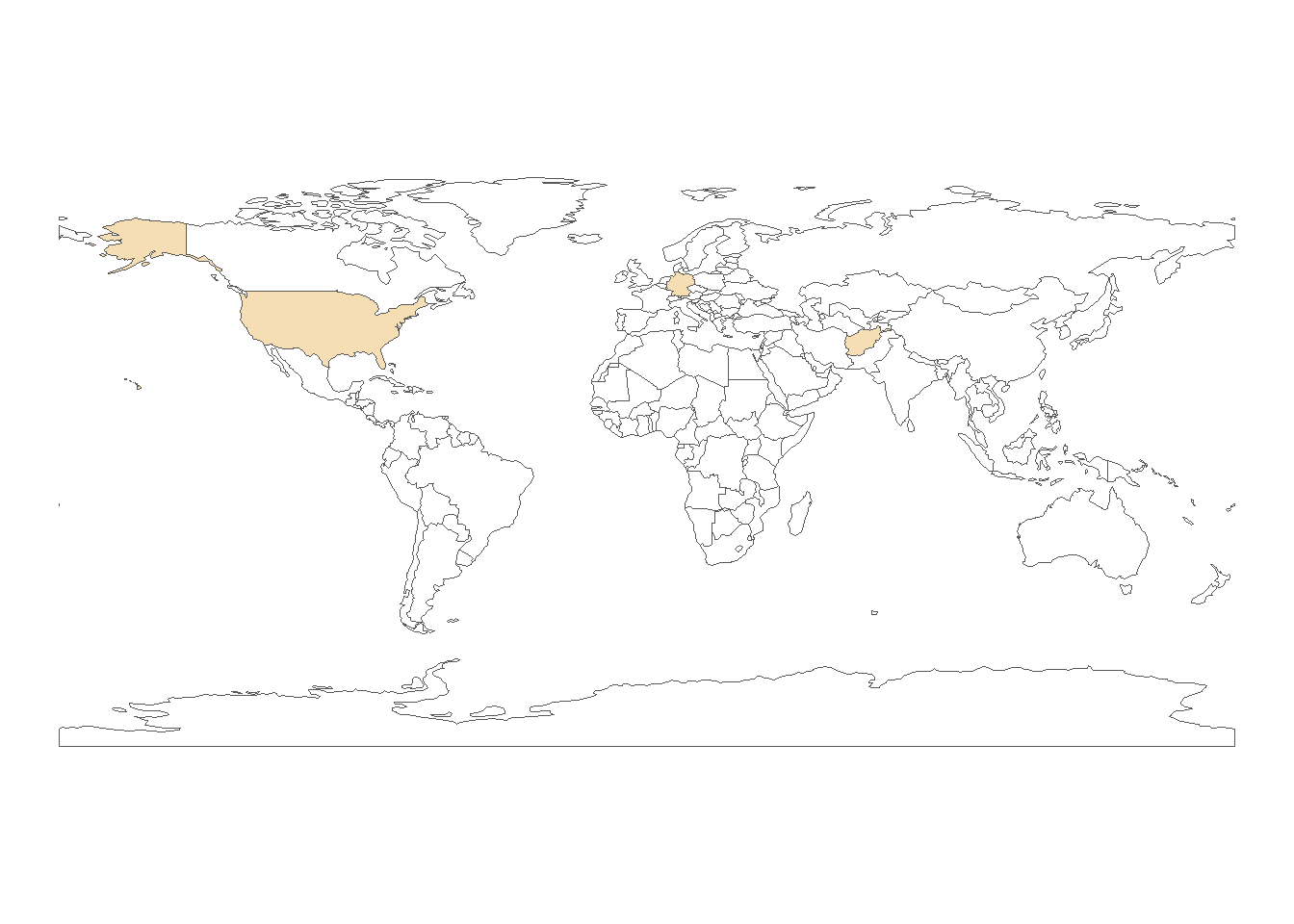
Prettier map
It doesn’t quite look like we’re used to, though. Check out the comments to see what we’ve changed.
ggplot() +
  # plot an sf object
  geom_sf(
    data = world,
    # fill it according to my variable
    aes(fill = is_my_country),
    # make borders lighter
    col = "grey80",
    # don't show the legend: it's just true or false, can be shown in title
    show.legend = FALSE
  ) +
  # add country labels
  geom_sf_text(
    # get the data just for the countries we want to show
    data = world |> filter(is_my_country == TRUE),
    # get the sovereignt label, and transform it to upper case
    aes(label = admin |> toupper()),
    # make it not as dark
    col = "grey30",
    # decrease size
    size = 2.5
  ) +
  # make colours prettier
  scale_fill_manual(values = c("white", "wheat")) +
  # change to a nicer projection: equal area (more accurate)
  coord_sf(crs = "ESRI:54009") +
  # remove clutter
  theme_void()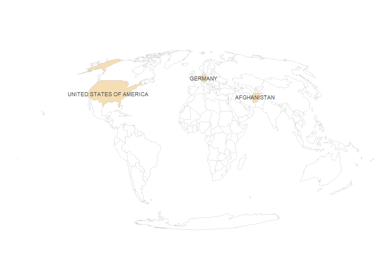
Prettier map with ocean
There’s just some lines of code you need to add to have a round earth/rounded sea. We need to create a polygon that has just the shape of the earth. We can do this with st_graticule, and then st_cast it to a polygon. Then, we can simply plot this polygon at the beginning of our ggplot.
grat <- st_graticule() |> st_cast('POLYGON')

ggplot() +
  # this is the new line
  geom_sf(data = grat, fill = "#d7ecfa", col = "#d7ecfa") +
  # now everything is the same as before
  geom_sf(
    data = world,
    aes(fill = is_my_country),
    col = "grey80",
    show.legend = FALSE
  ) +
  # add country labels
  geom_sf_text(
    data = world |> filter(is_my_country == TRUE),
    aes(label = admin |> toupper()),
    col = "grey30",
    size = 2.5
  ) +
  # make colours prettier
  scale_fill_manual(values = c("white", "wheat")) +
  # change to a nicer projection: equal area (more accurate)
  coord_sf(crs = "ESRI:54009") +
  # remove clutter
  theme_void()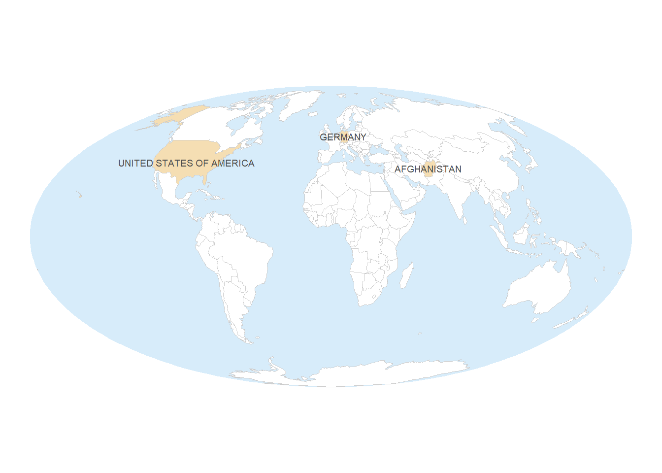
Advanced stuff
If you’re really interested, you can check out the following on top:
- graticules (latitude/longitude)
- North arrow (not recommended for world maps, though)
- scale (not recommended for most world maps, though)
Citation
BibTeX citation:
@online{listabarth2024,
  author = {Listabarth, Sarah},
  title = {Creating a Map with `Ggplot2`},
  date = {2024-01-04},
  url = {https://sarahlistabarth.github.io/blog/posts/creating-a-basic-map/},
  langid = {en}
}
For attribution, please cite this work as:
Listabarth, Sarah. 2024. “Creating a Map with `Ggplot2`.”
January 4, 2024. https://sarahlistabarth.github.io/blog/posts/creating-a-basic-map/.